
Redesigns and Logos
These are some logos that I have redesigned for school and some that I have designed for people and their businesses. The logo redesigns are always been my favorite because I like giving things a fresh new look. This is what I try to do when I am designing a logo for someone else. It’s a part of you and your logo should resemble some of who you are while also representing what you do.


Descriptions
Dawn Baker Fitness (2020)
This was a logo that I created for a family friend. She wanted something that reminded her of her handwriting, but also something that was easy to read. Also wanted a cursive font and a good serif font that went well together. I felt like those two were a really good compromise. Simple and sweet were some of the words that she described to me she had a vision of what she wanted her logo to look like.
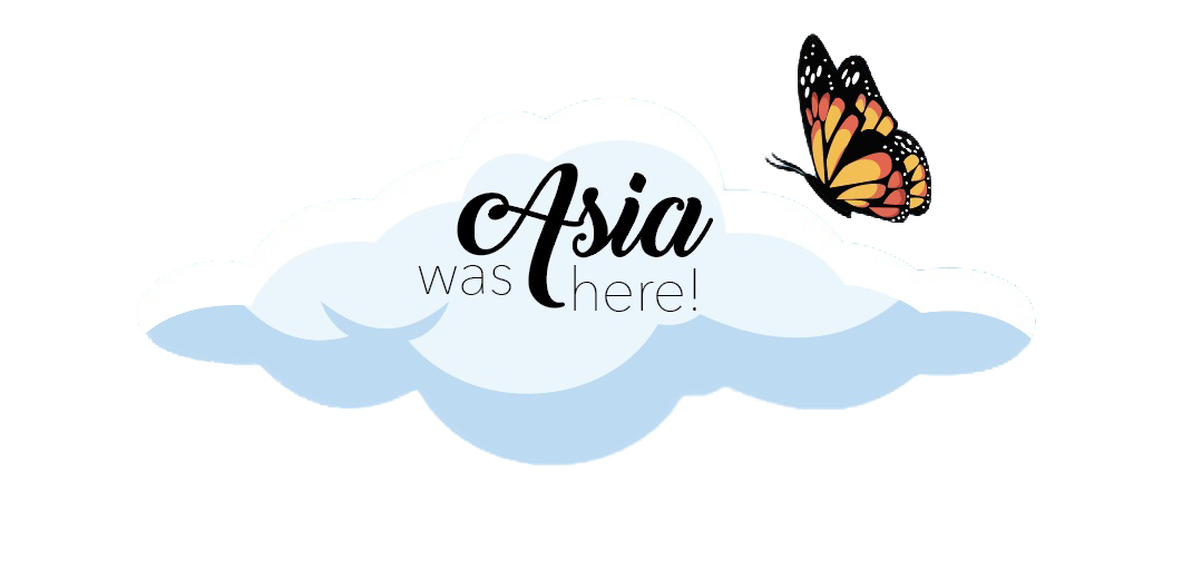
Dreams (2019)
Dreams was something that my sister and I tried to start as a business. This is the logo that I came up with for us. We wanted something that seemed mystical and fairytale-like. Something that we both could agree on and speak to both of us. The first that came to my mind was a butterfly because we both love them. Then we wanted something to surround it and the famous painting that inspired these hands is the first thing that came to my mind.
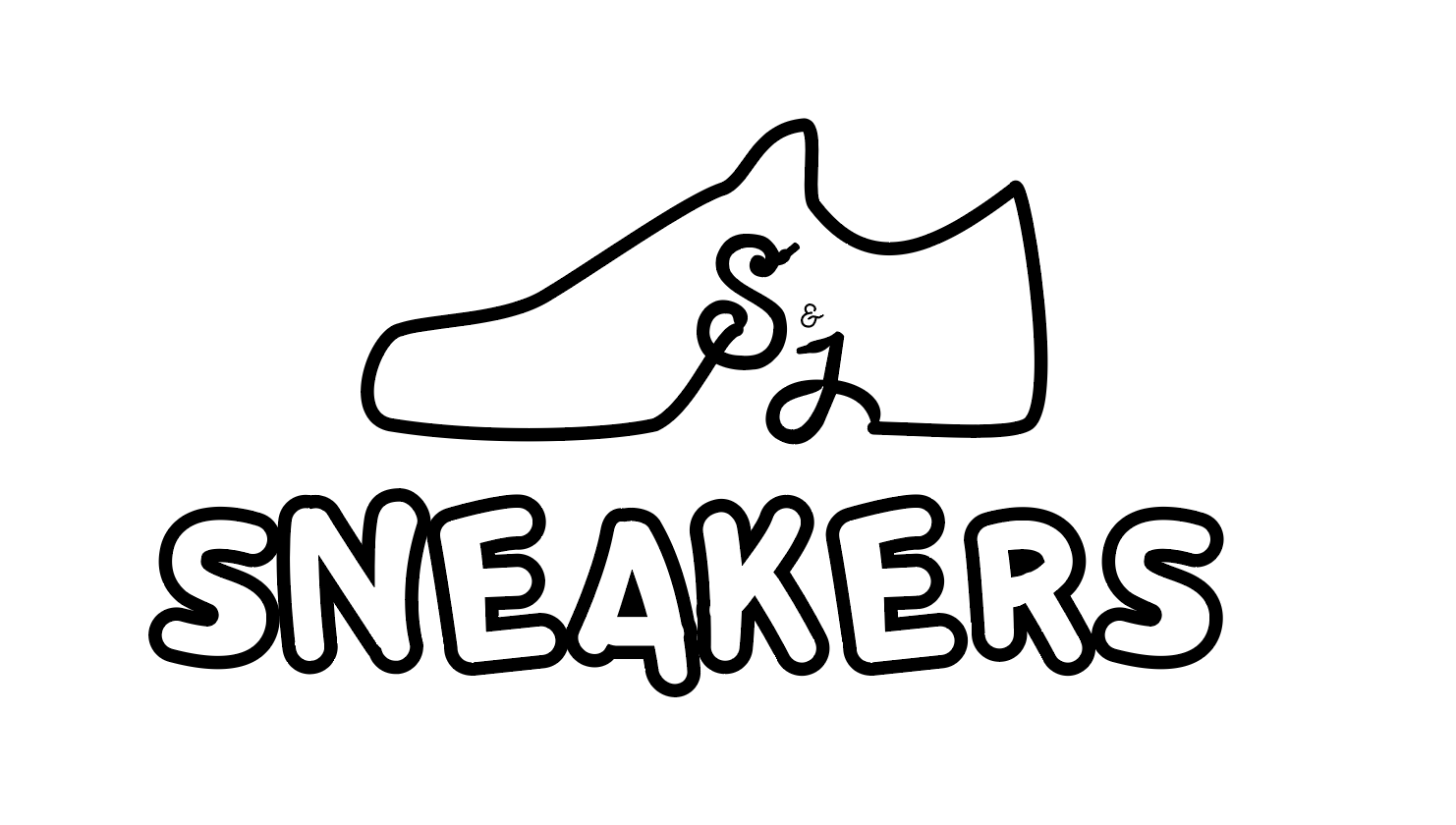
S&J Seankers (2021)
My friend wanted something for his sneakers business and he was very sure of what he wanted when we first talked about his logo. He wanted a shoe and he wanted two letters to be incorporated in the shoe itself somehow. What you see above is the final outcome. I just took an outline of a shoe and tried my best to make the S and J look like the ends of shoe strings so you could get the full effect of the shoe.
Winton Woods Kingfisher Trail Redesign (2021)
For a project at the Art Academy, we worked with a partner and we had to come up with a better way to show the information that was already on the Kingfisher. While also making it entertaining to the visitors that were coming to the trail. My partner and I designed two different perspectives one from a kid and one from an adult. We combined our signs together and there you have it. For a closer look click the button below!
Seedtime on the Cumberland Redesign (2021)
This was also a project done at the Art Academy. We had to pick an organization to design for and I picked Appalashop an organization in Kentucky that teaches film and radio to the kids that are interested and have trouble affording it. They have this event every year called Seedtime on the Cumberland where folk artists come and perform and there’s a bunch of other different activities. I designed the logo that you use above and also a brochure for the event. If you want to look further click the button below!
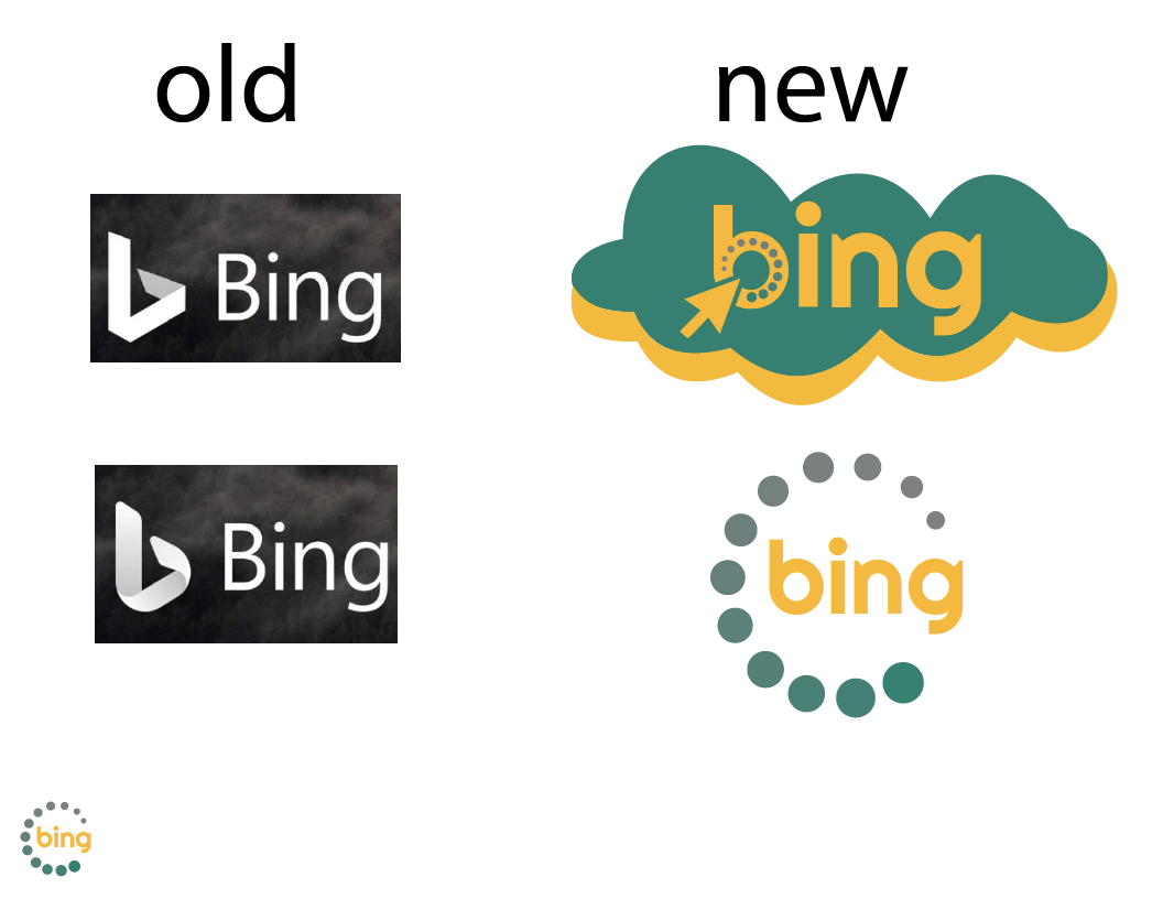
Bing Redesign (2020)
To start this project we had to pick three logos that we thought were the worst of the worst. Then, we had to pick one out of those three that we thought needed the most work. As you can see I picked Bing. With this logo redesign, I wanted to bring the color back and actually give the feel that it is a logo for a website, not a band.
Beauty by Jayden (2022) Looking at starting a business in lashes, makeup, waxing, and skincare. At first, she wanted something that included a cartoon similar to her with a face mask on, a nail polish bottle, and a makeup brush. So, I wanted to come a with a simplistic way to show all of the things that she wanted. After talking with her business partner she learned that they weren’t on the same page. I had to adapt and come up with something that fits both of their needs. Click the learn more button to see the other results!
BAC Dance Logo (2024)
This logo I made for the University of. Cincinnati dance team was something that I wanted to make different from other dance logos. I wanted the logo to cater to their style of dance and represent the team in the best was possible. So I started looking at the dance moves that they do that normally repeat in different dances.
UCBA Logo (2024)
This logo is also for the University of Cincinnati, but. for their Black Arts Collaberative. This group includes black dancers, artists, musicians, actors and actresses. They wanted to find a better way to incorporate all the things that do in one space. At first it was just circle split into four different sections with Black Arts Collaberative around it. I just wanted to take that and make it more interesting. Make people look and at it and be like ooohh I want sign up.
Mume Woo (2021)
This logo was created for a seamstress. I first started out with things of that nature.. scissors and needles. I showed those to her and see said no immediately. She wanted it way more simplified, but for there to just a little bit of dimension. So, that’s what I did.